Phil Empey Blog
Friday, December 10, 2010
Lesson 5
Lesson 4
Project 6 FInal Project

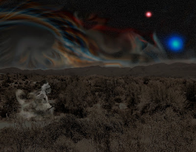
I started with a landscape desert scene and mask the sky. I darked the landscape photo to give the appearance of night time. I added a fractal design I made in Ultra Fractal program and set it in the background. I overlayed a separate starfield over the fractal and added 2 large suns. Also, I added a spirit dancer hovering over the landscape. I tried to create a native peyote experience. I was able to apply most of the photoshop techiques I learned from lessons from the textbook.
Project 4 Shoes with a Destination
Project 3 In Living Color
Saturday, December 4, 2010
Critique 5

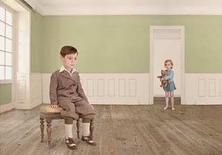
1. What is the visual content of this photo image? Describe actual objects. The photo is of a boy seated in the foreground with a little girl standing in a doorway holding a teddybear in what appears to be a light green room. Both children are dressed in period clothing.
2. Name three design elements, ingredients that are prevalent in this photo image, and explain how and where they are used. Three design elements in the image are lines of the rooms floorboards along with the room itself and the implied line between the children running between the foreground to the background, the colors of the room and children and the lighting of the room from window.
3. Name three design principles that are prevalent in this photo image, and explain how and where they are used. Three design principles are emphasis is on the boy in the foreground, proportion created between the flooring and walls within the room and the balance created between the children between the foreground and backgroud.
4. What type of color scheme is used ? Is color used effectively? The color scheme appears to be a restricted color palette of lighter tint colors. The colors appear to be to restricted for the image, giving the image an unfinished look.
5. What could be improved in this photo image to make it more visually effective? The color scheme should be widened for more colors.
6. What wins on this page, draw you in, catches your eye? The boy in the foreground is what catches your eye first with the implied line drawing your eye the little girl in the background.
7. Do you like this photo image? Explain why or why not. The image is lacking in colors leaving the image with a unsettling look to it along with how the children are posed giving them look of there are not alive.
Subscribe to:
Comments (Atom)


