Friday, December 10, 2010
Lesson 5
Lesson 4
Project 6 FInal Project
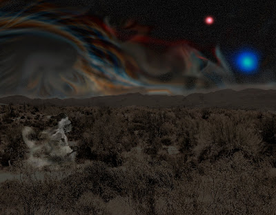
I started with a landscape desert scene and mask the sky. I darked the landscape photo to give the appearance of night time. I added a fractal design I made in Ultra Fractal program and set it in the background. I overlayed a separate starfield over the fractal and added 2 large suns. Also, I added a spirit dancer hovering over the landscape. I tried to create a native peyote experience. I was able to apply most of the photoshop techiques I learned from lessons from the textbook.
Project 4 Shoes with a Destination
Project 3 In Living Color
Saturday, December 4, 2010
Critique 5
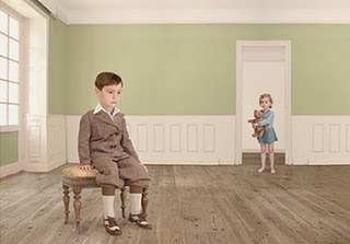
1. What is the visual content of this photo image? Describe actual objects. The photo is of a boy seated in the foreground with a little girl standing in a doorway holding a teddybear in what appears to be a light green room. Both children are dressed in period clothing.
2. Name three design elements, ingredients that are prevalent in this photo image, and explain how and where they are used. Three design elements in the image are lines of the rooms floorboards along with the room itself and the implied line between the children running between the foreground to the background, the colors of the room and children and the lighting of the room from window.
3. Name three design principles that are prevalent in this photo image, and explain how and where they are used. Three design principles are emphasis is on the boy in the foreground, proportion created between the flooring and walls within the room and the balance created between the children between the foreground and backgroud.
4. What type of color scheme is used ? Is color used effectively? The color scheme appears to be a restricted color palette of lighter tint colors. The colors appear to be to restricted for the image, giving the image an unfinished look.
5. What could be improved in this photo image to make it more visually effective? The color scheme should be widened for more colors.
6. What wins on this page, draw you in, catches your eye? The boy in the foreground is what catches your eye first with the implied line drawing your eye the little girl in the background.
7. Do you like this photo image? Explain why or why not. The image is lacking in colors leaving the image with a unsettling look to it along with how the children are posed giving them look of there are not alive.
Critique 4
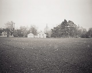
1. What is the visual content of this photo image? Describe actual objects. The visual content is of a old farm home in the background with what appears to be snow falling in the foreground.
2. Name three design elements, ingredients that are prevalent in this photo image, and explain how and where they are used. Lines created at the horizontal line at top of where the lawn begins, the texture of the lawn, and the color value of the black and white image.
3. Name three design principles that are prevalent in this photo image, and explain how and where they are used. There design principles are balance between the sky and lawn, a rhythm created from the falling snow down to the earth and the proportion between the the housing in the background and the lawn in the foreground.
4. What type of color scheme is used ? Is color used effectively? The black and white color scheme is effective in the photograph and help creates a period in time.
5. What could be improved in this photo image to make it more visually effective? The photo appears to be missing something in the foreground, which makes it plain photograph.
6. What wins on this page, draw you in, catches your eye? The falling snow is the most what catches your eye and but otherwise has no real emphasis on any one object.
7. Do you like this photo image? Explain why or why not. It is a plain image, I believe the image is to balance between the sky and lawn.
Critique 3


 1. What is the visual content of this photo image? Describe actual objects. Visual content of this image consists of a surreal image of a mans arm with small trees growing out of sitting in front of a window.
2. Name three design elements, ingredients that are prevalent in this photo image, and explain how and where they are used. Three design elements are shapes of the mans arm and the trees;the colors of the image and the texture of the rain on the windows in the background.
3. Name three design principles that are prevalent in this photo image, and explain how and where they are used. Three design principles are emphasis on the trees on the mans arm, rhythm of the trees growing and their unity.
4. What type of color scheme is used ? Is color used effectively? The color scheme is a restricted pallette of shades of blue and greys. The colors are used effectively in creating the mood of the image.
5. What could be improved in this photo image to make it more visually effective? If a larger color scheme was utilized my help improve the image.
6. What wins on this page, draw you in, catches your eye? What most catches your eye are the trees.
7. Do you like this photo image? Explain why or why not. I enjoy surreal photos and this photo has the elements that I like. It's very creative.
Tuesday, November 2, 2010
Tuesday, October 26, 2010
Tuesday, October 5, 2010
Open and Organize Lesson 1
No images for upload due to lessons dealing with opening and organizing images in bridge for photoshop.
Sunday, October 3, 2010
Favorite Search Engine
My favorite search engine is Dogpile. It is the best because it combines a number of other search engines.
Tuesday, September 21, 2010
Review 2
No image was posted for this review due to being a review on the basic of Photoshop, image rights, input Output, resolution, scanning and printing.
Critique 2
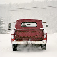
What is the visual content of this photo image? Describe actual objects. The visual content of this photo includes a 50's built truck sitting in a snow storm with a small child looking out the back truck.
Name three design elements, ingredients, that are prevalent in this photo image, and explain how and where they are used. The photo includes the design elements color, direction and texture. The trucks red color makes the truck really stands out in the white snow storm. How the snow falls at an angle brings your eye toward the truck, The trees in the background with the snow falling in front creates interesting background.
Name three design principles that are prevalent in this photo image, an explain how and where they are used. Three design principles that are prevalent within the image are emphasis, rhythm and unity. The emphasis principle is created by the snow storm and the trucks red color. The rhythm is created by the snow falling down in front of the truck. The photos unity is created from the white of the snow bring your attention to the truck.
What type of color scheme is? Is color used effectively? The color scheme consists of two colors red and white. The color of the truck is effect against the white of the snow storm making an interesting photo.
What could be improved in this photo image to make it more visually effective? It's hard to say being a photograph. Maybe the little kid in the trucks back seat making some sort of face would bring a more comic feel to the photo.
What wins on this page, draws you in, catches your eye? The first thing that is noticed is the red truck in the snow storm and then you notice the child looking out the back window and kind of a surprise.
Do you like this photo image? It's a likable photo. Without the child looking out the back window it would just be a cold feeling photo. The child adds a bit of warmth to the photo.
Tuesday, September 14, 2010
Critique 1
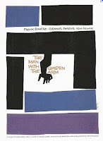
1. What is the visual content of this photo image? Subject content is a movie poster made up of black, blue and purple colored blocks with arm within the center of the poster.
2. Name three design elements, ingredients, that are prevalent in this photo image and explain where hey are used. Three design elements within the image are line, color and shape. The line cuts between the colored blocks. Color and shapes give the blocks give contrast between the blocks.
3. Name three design principles that are prevalent in this photo image, and explain how and where they are used. The three prevalent design principles utilized are balance, proportion and rhythm. Balance is utilized with the different blocks giving the image a symmetrical appearance. Proportion is used by the different size blocks help centering the images title. The rhythm principle also helps by bringing to the title in the center.
4. What type of color scheme is used? Is color used effectively? The color scheme used within the image is a lighter toned color scheme. The color scheme does not appear to be used effectively due to the image title is called The Man With The Golden Arm with arm being black.
5.What could be improved in this photo image to make it more visually effective? The black arm in the poster could be gold to go along more with the title.
6. What wins on this page, draws you in, catches your eye? How the different size blocks are arranged brings your attention to the title within the images center.
7. Do you like this photo image? Explain why, or why not. I do like the photo image it gives you an idea when the movie was made during the 1960’s which is now a retro look..
Tuesday, August 31, 2010
Subscribe to:
Comments (Atom)


